Facebook
 X
X
 Pinterest
 Copy Link
We all want our homes to provide comfort and ease. And something instinctual tells us that color — whether a can of paint, a bright new patterned rug, maybe that sun-drenched painting you saw at the last art opening you attended — can change our world for the better.
Picking the right colors for our homes is not magic. The process simply requires that we look at the physical qualities of our home’s architecture and apply color that will put the focus where we want it. Here’s how.
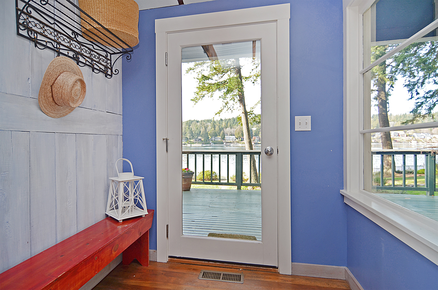
Create a positive entrance. Storage is key to organizing typically cluttered areas, like a front entrance or mudroom, but color is equally important. Use a light color for walls and trim for an entrance that is cramped. Small, awkward spaces expand when painted a cool white or blue, dropping walls back.
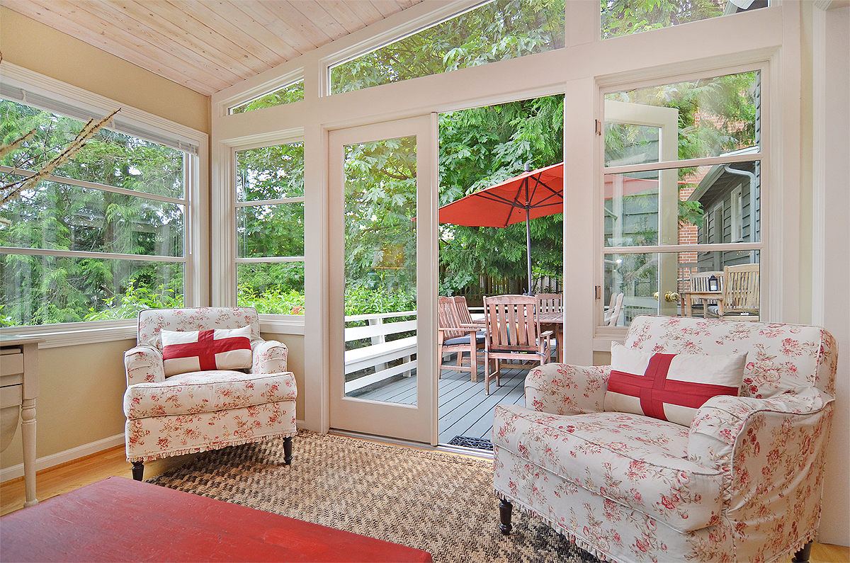
Pick wall colors that optimize sunlight. Natural light is what we all crave in varying amounts. Decide how the light coming from windows and doors aids your use of each room, and at what point during the day. A sunny kitchen first thing in the morning is perfect for a busy family that wants to get up and meet the day. Want to amplify light? Use white and shiny surfaces that reflect. Want to cut back on glare? Window treatments are an easy fix, but consider that you may want to keep the view and subdue the impact of the reflective planes. Gray is a color solution for a room with a glare.
Use color to play up or play down features. Sometimes the house that you call home is as uncoordinated as a growing teenager. Additions built when space was in demand can confuse the overall design. Proportions in one part of the house may be different than those in another, which can make certain features stand out when you wish they’d recede. Doorways that are too large make others look small.
The visual presence of architectural elements can be controlled by the value and intensity of their color. Want something to stand out and make an impression? Paint it the most saturated or contrasting color in the room.
If you want something to go away, paint it the same color as its surroundings. Is something too large and imposing for your space? Choose a color that is dark and gray. Charcoal will shrink and set what was once a foreground element into the shadows.
Let color create a visual path. Repetition is an important element in good design and helpful for finding our way through a space. Establish a feature or material in your home that you want to have noticed, then use its color repeatedly throughout the floor plan.